

Recently, my friend Chris Huntingford, showed me a pretty jazzy report he built with AI in Power BI, and the simple story really is that there was just one thing I had to take away which he utilised in his report.
Did you know there’s a visual in Power BI which you can feed with some data, and then some more to tell is what to extract from the data, and using AI it will produce natural language and deep dive insights highlighting influential points in your data?! 📊 😮
Using key influencers
So, lets dive right into looking at the key influencers visual! I’m going to use the example of some data in my tenant for the Centre of Excellence toolkit here! I’m going to look at the connection references that have been created across my tenant in order to understand the connections being used by makers in my organisation.
So let’s take a look at how I’ve got the visual configured.
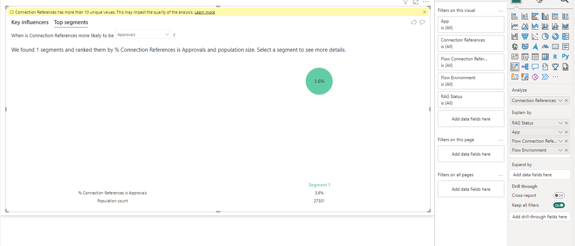
So here I’ve got my analyse parameter holding all of my connection references which is basically a bunch of connector names and how many times each have been used represented by duplicate records.
Then in the background I’ve given each connector a RAG status to help analyse this data. Then I’m going to dump this data in the explain by parameter along with some other properties provided by the CoE toolkit including the app the connection reference is used for, the flow, and the flow environment.
Simple configuration right? Basically, all we do is tell the visual what data to analyse, and what to use to explain it! 🤩
What does it do?
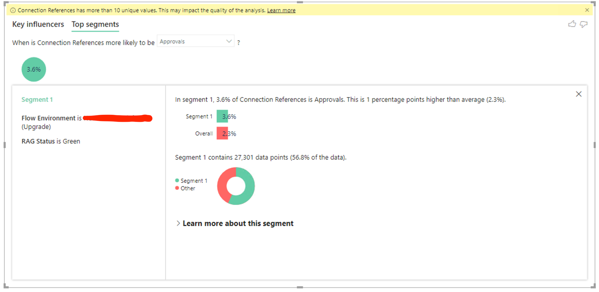
So taking a look at the visual, we have two areas separated by tabs to begin with. Key influencers, and top segments. Starting with key influencers, we get different insights into where influential patterns affect whats going on for us. For example with connection references here, I can see that where the user is such a person, its 10x more common for them to have used a connector I’ve scored as a red in my RAG status.
Now on the second tab we can dive in a little deeper and interact with the data a bit more. I can actually select segments that have been identified with patterns in my data to dive in deeper on and see more insights about.
Did you like this content? 💖
Did you like this content? Check out some of the other posts on my blog, and if you like those too, be sure to subscribe to get my posts directly in your inbox for free!
Subscribe