

Hello Friends! 👋 💖 Thanks for coming back to see part 2 of my mini-series on building a solution for planning revision and assignments, designed for the student / education audience!
In the last post on this solution build, we built a custom connector to retrieve Teams assignments for the current user logged in.
Now, we need to start to build our application or front end that our users are going to interact with! In my case I’m going to build a canvas app. If you’d like to surface the data in another way, feel free to do so! This guide will demonstrate how to end up with the first screen I’ll be making as part of my canvas app which will come as part of the end solution on my GitHub once this mini-series / build is complete! ⭐️
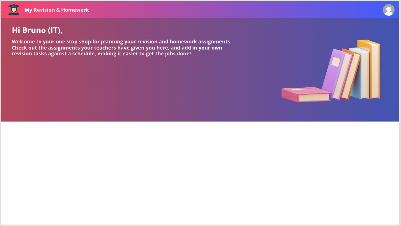
By the end of this post, you should have a first screen which looks a bit like the below.
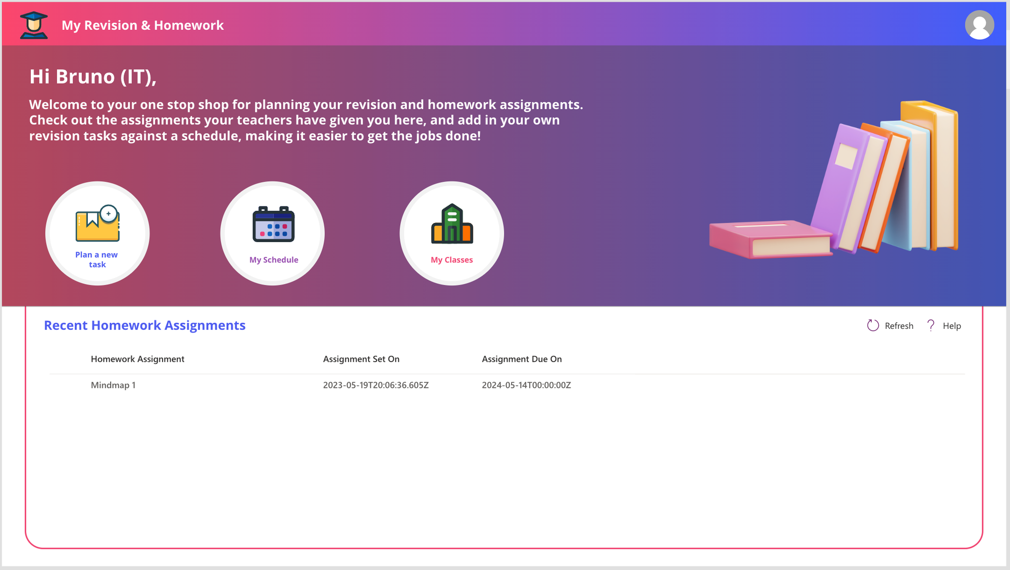
Cool, huh? 🤔 Follow along to learn how to build it!
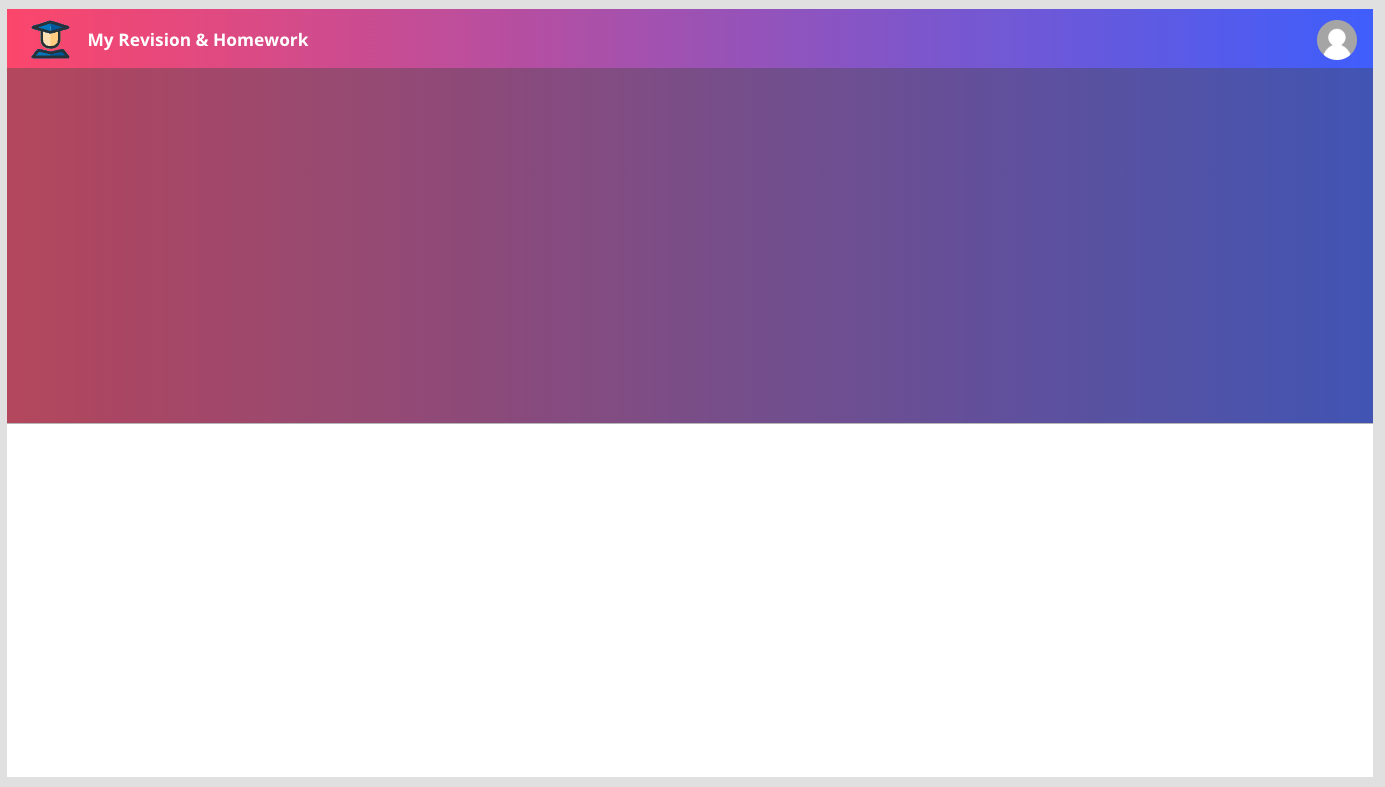
Header and Upper Section Background
So first we will work on the header and upper section background. Let’s focus on the upper section background to start with. I’m going to start by adding a HTML Text control to my screen and I’ll stretch it to size the top half of my screen horizontally. I’ll then set the padding properties all to 0.
Now I’ll populate the HTML text property with the following code. This should create a pink to blue type gradient which makes a nice background.
"<div style = "" height: " & Self.Height - 1 & "px; width: " & Self.Width & "px; background: linear-gradient(to right, #fc466b, #3f5efb); "" ></div>"Now I’m going to layer a rectangle over the top of my HTML control and just darken the background a little bit with a semi transparent grey fill on my rectangle. Use the following RGBA value for your rectangle.
RGBA(71, 71, 71, 0.4)Now we’ll work on getting the header block in. I’m going to add another HTML Text control to my screen at the very top with the following sizing properties populated.
Then in the HTML Text property, I will add the following HTML.
"<div style = "" height: " & Self.Height - 3 & "px; width: " & Self.Width & "px; background: linear-gradient(to right, #fc466b, #3f5efb); box-shadow: linear-gradient(to right, #fc466b, #3f5efb) 0px 6px 16px;"" ></div>"Header Elements and Icons
So now I’m going add some elements into my header such as a little left hand logo, an application title and a profile image.
Starting with the logo on the left hand side I’m going to add an image control and then add this SVG code into the image property.
"data:image/svg+xml;utf8, "&EncodeUrl("<svg width='800px' height='800px' viewBox='0 0 32 32' fill='none' xmlns='http://www.w3.org/2000/svg'>
<path d='M23.3 8.40007L21.82 6.40008C21.7248 6.27314 21.6008 6.17066 21.4583 6.10111C21.3157 6.03156 21.1586 5.99693 21 6.00008H11.2C11.0555 6.00007 10.9128 6.03135 10.7816 6.09177C10.6504 6.15219 10.5339 6.24031 10.44 6.35007L8.71998 8.35008C8.57227 8.53401 8.49435 8.76424 8.49998 9.00008V16.2901C8.50262 18.0317 9.19567 19.7013 10.4272 20.9328C11.6588 22.1644 13.3283 22.8574 15.07 22.8601H16.93C18.6716 22.8574 20.3412 22.1644 21.5728 20.9328C22.8043 19.7013 23.4973 18.0317 23.5 16.2901V9.00008C23.5 8.7837 23.4298 8.57317 23.3 8.40007Z' fill='#FFCC80'/>
<path d='M29.78 28.38L25.78 23.38C25.664 23.2321 25.5086 23.1198 25.3318 23.0562C25.1549 22.9925 24.9637 22.98 24.78 23.02L16 25L7.21999 23C7.03632 22.96 6.84507 22.9725 6.6682 23.0362C6.49133 23.0998 6.33598 23.2121 6.21999 23.36L2.21999 28.36C2.10392 28.5064 2.03116 28.6823 2.00995 28.8679C1.98874 29.0534 2.01993 29.2413 2.09999 29.41C2.17815 29.5839 2.3044 29.7319 2.46385 29.8364C2.62331 29.9409 2.80933 29.9977 2.99999 30H29C29.1885 29.9995 29.373 29.9457 29.5322 29.8448C29.6914 29.744 29.8189 29.6002 29.9 29.43C29.98 29.2613 30.0112 29.0734 29.99 28.8879C29.9688 28.7023 29.8961 28.5264 29.78 28.38Z' fill='#01579B'/>
<path d='M29.29 6.00003L16.29 2.00003C16.0999 1.95002 15.9001 1.95002 15.71 2.00003L2.71 6.00003C2.49742 6.06422 2.31226 6.19735 2.1837 6.37841C2.05515 6.55947 1.99052 6.77817 2 7.00003C1.9917 7.22447 2.0592 7.44518 2.19163 7.62659C2.32405 7.80799 2.5137 7.93954 2.73 8.00003L15.73 11.6C15.906 11.6534 16.094 11.6534 16.27 11.6L29.27 8.00003C29.4863 7.93954 29.6759 7.80799 29.8084 7.62659C29.9408 7.44518 30.0083 7.22447 30 7.00003C30.0095 6.77817 29.9448 6.55947 29.8163 6.37841C29.6877 6.19735 29.5026 6.06422 29.29 6.00003Z' fill='#01579B'/>
<path d='M11.22 6C11.0756 5.99999 10.9328 6.03127 10.8016 6.09169C10.6704 6.15211 10.5539 6.24023 10.46 6.35L8.74 8.35C8.58509 8.53114 8.49998 8.76166 8.5 9V16.29C8.50264 18.0317 9.19569 19.7012 10.4272 20.9328C11.6588 22.1643 13.3283 22.8574 15.07 22.86H16V6H11.22Z' fill='#FFE0B2'/>
<path d='M7.21999 23C7.03632 22.96 6.84507 22.9725 6.6682 23.0362C6.49133 23.0998 6.33598 23.2121 6.21999 23.36L2.21999 28.36C2.10392 28.5064 2.03116 28.6823 2.00995 28.8679C1.98874 29.0534 2.01993 29.2413 2.09999 29.41C2.17815 29.5839 2.3044 29.7319 2.46385 29.8364C2.62331 29.9409 2.80933 29.9977 2.99999 30H16V25L7.21999 23Z' fill='#0277BD'/>
<path d='M15.71 2.00002L2.71 6.00002C2.49742 6.06422 2.31226 6.19734 2.1837 6.3784C2.05515 6.55947 1.99052 6.77817 2 7.00002C1.9917 7.22447 2.0592 7.44518 2.19163 7.62658C2.32405 7.80799 2.5137 7.93954 2.73 8.00002L15.73 11.6C15.8194 11.6146 15.9106 11.6146 16 11.6V2.00002C15.9039 1.98469 15.8061 1.98469 15.71 2.00002Z' fill='#0277BD'/>
<path d='M2.73 8.00003L8.5 9.56003V16.29C8.50264 18.0317 9.19569 19.7013 10.4272 20.9328C11.6588 22.1643 13.3283 22.8574 15.07 22.86H16.93C18.6717 22.8574 20.3412 22.1643 21.5728 20.9328C22.8043 19.7013 23.4974 18.0317 23.5 16.29V9.56003L29.27 8.00003C29.4863 7.93954 29.6759 7.80799 29.8084 7.62659C29.9408 7.44518 30.0083 7.22447 30 7.00003C30.0095 6.77817 29.9448 6.55947 29.8163 6.37841C29.6877 6.19735 29.5026 6.06422 29.29 6.00003L16.29 2.00003C16.0999 1.95002 15.9001 1.95002 15.71 2.00003L2.71 6.00003C2.49742 6.06422 2.31226 6.19735 2.1837 6.37841C2.05515 6.55947 1.99052 6.77817 2 7.00003C1.9917 7.22447 2.0592 7.44518 2.19163 7.62659C2.32405 7.80799 2.5137 7.93954 2.73 8.00003ZM21.5 16.29C21.4974 17.5013 21.015 18.6621 20.1586 19.5186C19.3021 20.3751 18.1412 20.8574 16.93 20.86H15.07C13.8588 20.8574 12.6979 20.3751 11.8414 19.5186C10.985 18.6621 10.5026 17.5013 10.5 16.29V10.11L15.73 11.56C15.906 11.6134 16.094 11.6134 16.27 11.56L21.5 10.11V16.29ZM16 4.05003L25.44 7.00003L16 9.56003L6.56 7.00003L16 4.05003Z' fill='#263238'/>
<path d='M25.78 23.38C25.664 23.2321 25.5086 23.1198 25.3318 23.0562C25.1549 22.9925 24.9637 22.98 24.78 23.02L16 25L7.21999 23C7.03632 22.96 6.84507 22.9725 6.6682 23.0362C6.49133 23.0998 6.33598 23.2121 6.21999 23.36L2.21999 28.36C2.10392 28.5064 2.03116 28.6823 2.00995 28.8679C1.98874 29.0534 2.01993 29.2413 2.09999 29.41C2.17815 29.5839 2.3044 29.7319 2.46385 29.8364C2.62331 29.9409 2.80933 29.9977 2.99999 30H29C29.1885 29.9995 29.373 29.9457 29.5322 29.8448C29.6914 29.744 29.8189 29.6002 29.9 29.43C29.98 29.2613 30.0112 29.0734 29.99 28.8879C29.9688 28.7023 29.8961 28.5264 29.78 28.38L25.78 23.38ZM5.07999 28L7.38999 25.11L15.78 27C15.9251 27.0299 16.0748 27.0299 16.22 27L24.61 25.13L26.92 28H5.07999Z' fill='#263238'/>
</svg>")
That’s a lot, huh! 🤯
Next to the student SVG image, I’m going to add a text label with the words “My Revision & Homework” and I’ll set the text weight to bold. Then finally on the right I’ll add another image control, I’ll set the border radius so that the image is completely round and I’ll set the image property as the following formula.
User().ImageNow we have things looking a little like this…
Some upper section text and a 3D image
So now we’re going to work on adding our upper section text and a 3D image. I’ll start by using text labels with my font colour set to white to add some text on the left hand side. Add text here which matches what you’d like it to say.
Then on the right hand side I’ve added an image using a media file (jpg) of some 3D books which you can download and add into your application from here.
3d book for education 21305022 PNG (vecteezy.com).
Now we have things looking a bit like this…
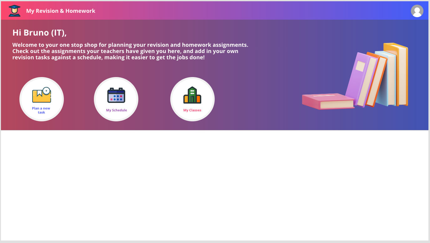
Round action buttons
Now let’s work on adding in our action buttons. For each of these I’m layering a few controls and grouping them together. For each of the round buttons that has a bit of box shadow I’m first using a HTML control for the background and look and feel of the button.
Add a HTML text control for your first button and use the following HTML in the HTML text property.
"<div style = "" width: 130px; height:130px; background-color: #ffffff; border-radius: 50%; box-shadow: 0 0 0 6px #f2f2f2; margin:10px""></div>"Now I’m simply layering over some relevant SVGs to the actions I want to add in, and I’m adding some coloured text under each of the icons.
I found some of my SVG’s here which you can use – School Vector SVG Icon (120) – SVG Repo
Finally to make the buttons clickable and have some change when we hover over them or focus on them, I’ve added a button control with border radius set to make it rounded like a circle. Then I’m setting the colour properties to make the button transparent except for the hover where it is semi transparent with a slight glassy grey look to make it look selectable.
We should now have our screen looking something like this…
Recent Homework Assignments
Now for the recent homework assignments I’m using a button control again to get my pink curved outline to my list of data. I’m simply hiding the top of this under my background. Then I’ve added a little text label with blueish text to say ‘Recent Homework Assignments’ and finally I have added some more complicated code components to display my data.
The code components I have used here are from the Creator Kit by Microsoft. So you’ll need to make sure you have those installed to use them here.
Once you’ve ensured you have those properly imported into your environment, you can go ahead and add the Fluent Details List component to your screen and the Fluent Command Bar component.
A slightly functional element…
So, to make this work so we can apply some design to our data list, we’ll need to add some functioning elements in here to get a result. In the data pane of your application, create a connection with the My Assignments connector we created in my blog post yesterday. If you haven’t created that yet, check the post out here.
In the OnVisible property of the screen we’re working on, now add the following code…
Set(gblMyAssignments,'My Assignments'.getmyassignments().value)Now in the Records(Items) property of your Fluent Details List control, add the following formula…
gblMyAssignmentsNow in the fields, edit and add the displayName, assignedDateTime, and dueDateTime fields.
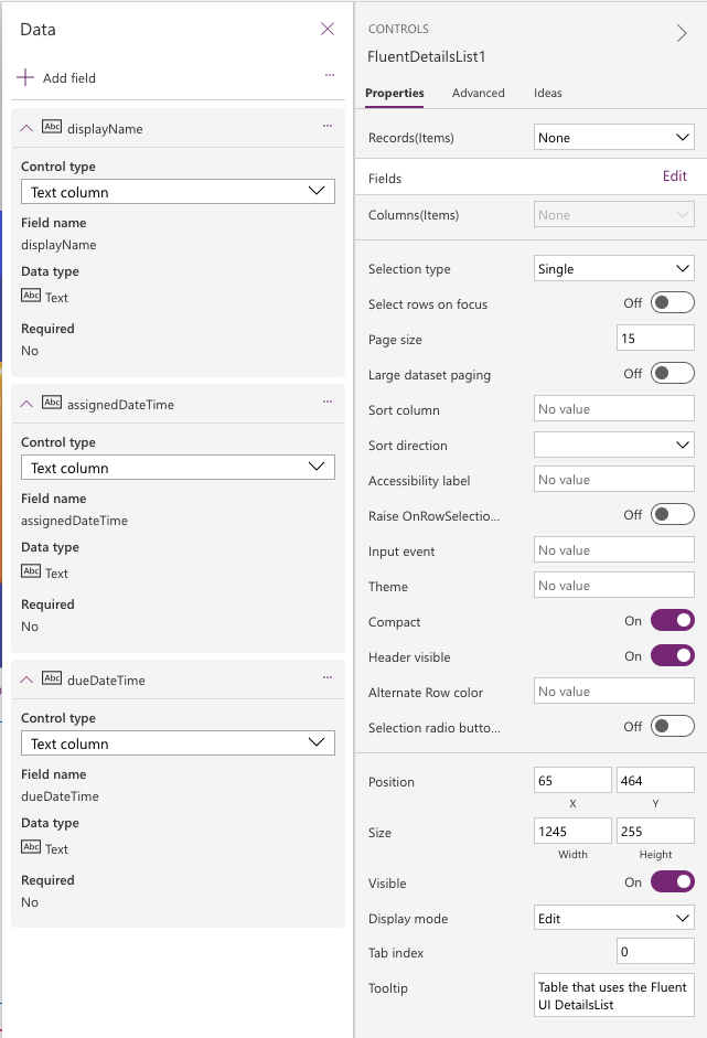
Finally in the Columns(Items) property add the following…
Table(
    {
        ColName: "displayName",
        ColDisplayName: "Homework Assignment",
        ColWidth: 300,
        ColSortable: true,
        ColIsBold: true,
        ColResizable: true
    },
     {
        ColName: "assignedDateTime",
        ColDisplayName: "Assignment Set On",
        ColWidth: 200,
        ColSortable: true,
        ColIsBold: true,
        ColResizable: true
    },
     {
        ColName: "dueDateTime",
        ColDisplayName: "Assignment Due On",
        ColWidth: 200,
        ColSortable: true,
        ColIsBold: true,
        ColResizable: true
    }
)
Now you should see your data listed in the code control! 💖
Finish up by adding the Command Bar component to your screen and add this code into the Items property…
Table(
   {
        ItemKey: "refresh",
        ItemDisplayName: "Refresh",
        ItemIconName: "refresh"
    },{
        ItemKey: "help",
        ItemDisplayName: "Help",
        ItemIconName: "help"
    }
)
And on that note, you should have a pretty finished looking screen! 😍

Overview
So, in this post, we knocked up the design of our first screen, and even utilised the custom connector we built yesterday! In tomorrow blog post, we’ll start to make some of the controls on our screen functional, and we’ll build out some other screens!
Make sure you’re subscribed to my blog to get the rest of the posts in this series directly in your inbox! 📩
See ya tomorrow! 💖